8 September 2018 is Graduation Day at SUTD. As we celebrate this occasion, let us hear from Jordan Sim (Engineering Systems and Design, Class of 2018) as he reflects upon his SUTD experience.

Really glad for the opportunity to share my SUTD experience. Through the various courses, overseas exchanges and internship, I have come to define my own personal take on ‘A Better World by Design’ and constantly seek to apply it on my projects. As a systems engineer, creating a better world by design means continually seeking improvement in all things through creative approaches, without bringing harm onto others; in economic terms, pushing Pareto optimality boundaries through innovation.
During my pillar years, I have worked on many projects involving big data – mostly for analytics and some for visualisation. While working on these projects, I always look for innovative methods and fresh perspectives as part of my problem-solving approach.
Making Maps
One of my memorable work was not from an ESD (Engineering Systems and Design) module but a HASS (Humanities, Arts and Social Science) module. As part of the broad-based SUTD curriculum, students are required to take a HASS module in all the terms in the pillar years.
In term 5, I took “Making Maps” taught by Asst Prof. Ate Poorthuis. One of our weekly lab sessions was to create an info-graphic map that visualises key aspects of the given data. The data we analysed was from the NEA website and it contained the tender bids for stalls at hawker centres in Singapore. We looked at how prices vary across stalls of different sizes and types (cooked, lockup, market).
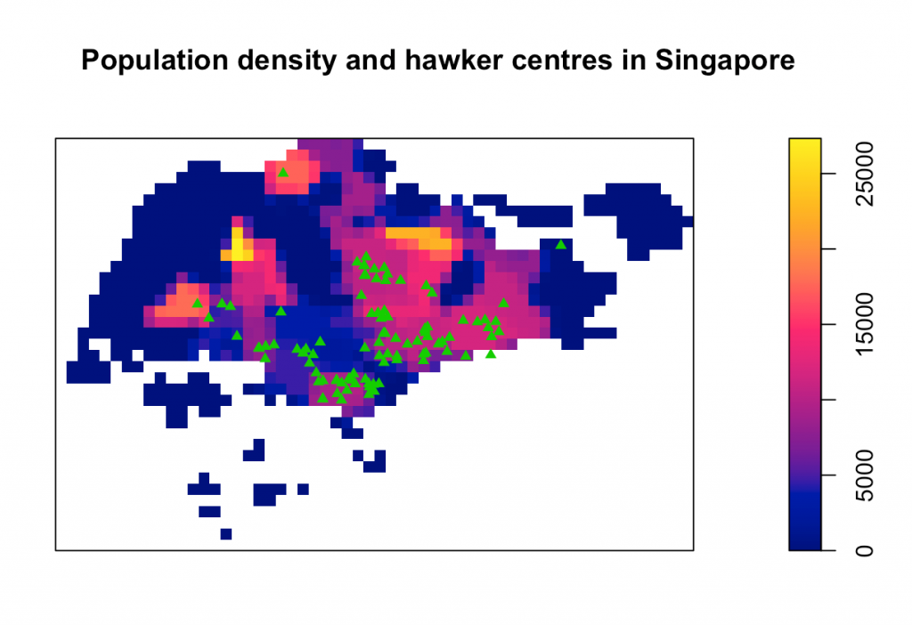
The most interesting visual that I created during this course was a heat map showing the population density of Singapore, superimposed with the location of all hawker centres.

From this visualisation, I gathered the following insights (an excerpt from my lab report):
“From these two layers of spatial data, it is evident that hawker centres tend to cluster in areas with higher population density. However, there are areas which have relatively high density with no hawker centres in the locale. These areas are new towns: Sengkang, Hougang in the northeast and Choa Chu Kang in the northwest. The absence of hawker centres in these areas could be due to the presence of shopping malls and eateries. Choa Chu Kang and Bukit Panjang have a total of 6 malls: Bukit Panjang Plaza, Fajar Shopping Centre, Greenridge Shopping Centre, Junction 10, Sunshine Place, Lot One. Sengkang and Hougang have 7 malls: Waterway Point, Rivervale Mall, Compass One, Greenwich V, Seletar Mall, Hougang Green Shopping Mall, Punggol Plaza. Due to the increased number of malls built by developers, perhaps the need for hawker centres has dwindled.”
This project left an impression on me. I realised that doing a geospatial analysis to discover the causation and correlation of population density and hawker centres is definitely something worth exploring especially with open-source geographical information system application. It also impressed upon me that visualisation of data allows for results/insights that plain numbers and figures cannot.
Jordan Sim, Engineering Systems and Design


